- Honored with a FWA Site of the day Award ( Our 2nd FWA SOTD Award in a week with I N S P I R I T )
The Challenge
Translating the experience of flight to a modern web-browser required a high level of realism, so we opted to develop it using webGL. Achieving realistic clouds and coloring for the sky was essential. These were also the two most difficult aspects when it came to finding an optimal technical solution both in terms of results and performance.
Our goal was to give freedom of movement, with several cameras delivering the best possible angles of the aircraft in flight. Because of this, it was essential to provide a flexible solution for adequate rendering, in all combinations and depending on the user’s interactions.
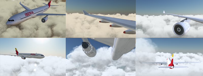 Captures from some of the flight’s cameras
Technical analysis
If you would like to examine some of the techniques, add ?debug=true. By pressing the ( o ) key you can activate the orbit control and with the ( space-bar ) key you will be able to switch cameras.
The Clouds
One of the first surprises was how costly and complex in terms of processing it was to simulate volumetric clouds. Our solution was to simulate 2d clouds, based on particles and their position, which were always perpendicular to the camera.
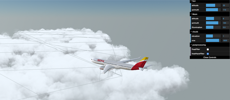 Rendered clouds
The Sky
The sky presented us with a new challenge. We needed to generate different light-scenarios (sunrise, full daylight, sunsets, nights etc). After testing static cubemaps and video renders, we found a magnificent sky shader It was developed by zz85 and simulates the daily cycles of light with an amazing performance. To reinforce the "look and feel" requested by the project’s Art Direction, we coordinated the shader with a sun texture (glimmering) for different times of day, and adapted it to admit starry skies at night.
Another key element for realism was positioning the sun and moon onstage, and synchronizing it with the time at which the flight took place. For this we used the SunCalc library. It allowed us to know the position of the sun, the moon and the moon phase at all times depending on the latitude and longitude of the aircraft.
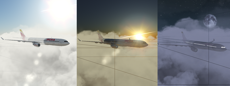 Different times of day
Post-production and FX
Shaders
Shaders were essential to improving the aesthetics of rendering. It’s important to mention an fxaa used to soften the image, as we avoided using antialiasing on WebGLRenderer for better performance. We also used a heat haze that distorted the image simulating burning fuel from the engines, and focused it only to the rear of each turbine.
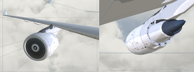 Heat Haze shader
3D sound
As a bonus, the lower camera on the aircraft allows viewers to approach the engines. Besides showing the heat of burning kerosene, we introduced two audio emitters at each of the motors. That way you can listen to each turbine’s engine (especially with headphones), more or less depending on the position of the camera.
Animation of the plane
For airplane movement to be softer, guided by the accelerometer - or the keystrokes- and the camera, we used an autonomous agent. In our case we needed to simulate an imaginary pointer that the user was handling, something similar to the pulling of a rope from the direction the plane is heading towards . And in the case of the cameras we used arriving behavior to be produce a more natural movement, as if you were tilting your head.
Sound effects and voiceovers
We recorded the voice of a flight attendant and a pilot to accompany the user during the flight, they were the "storytellers" of the experience. We also used typical airport sounds and noises from inside and outside the aircraft to enrich it. Furthermore we mixed three different engine noises that became more or less intense depending on the camera you were using.
Project Structure
Development was greatly accelerated thanks to tools like Grunt used to automate publishing tasks for both desktop and mobile, and Bower, to manage library packages.
We used general libraries like jQuery, TweenMax, SoundJS or PreloadJS to make programming more comfortable. And we took advantage of the benefits of js-signals for event handling, and of handlebars for templates.
In the part of the real-time application, a single file with under 200 lines with the socket.io library programmed in node.js allowed us to create different rooms for each experience, using a single source code.
3D Three.js
Of course, the base of everything was the 3D three.js Javascript library, of which we have used several examples and classes. Additionally, we fragmented the WebGL part into numerous files for each class, the result was a more structured and scalable project.
Art and usability
User interaction
We had to make out what forms of interaction the user would be allowed during the flight, to avoid the aircraft being put into unwanted positions. These were some of the first proposals for interactions, though in the end we opted to provide more camera movement, and some accelerometer use to slightly vary the aircraft position.
 Proposals for interaction with the plane
Mobile usability
Another challenge was to create an interface for the mobile part that was comfortable to handle, adapted to technical limitations. This was especially applicable to iOS devices, they do not allow a clear full screen the way that Android devices do. The image below shows several interface design tests and their evolution.
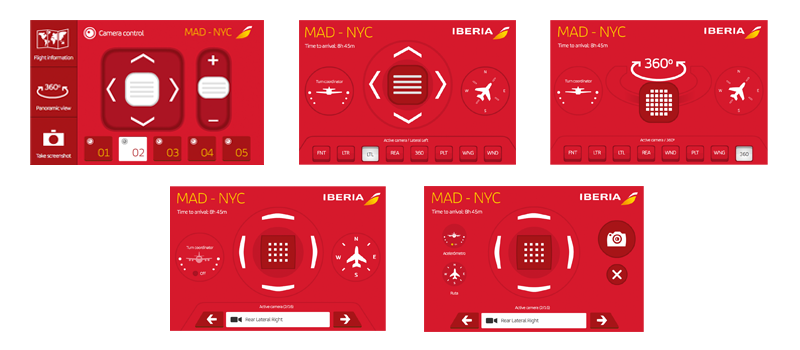 Evolution of the mobile UI
Less is more when it comes to polygons
We use Blender to work full 3D visuals. Our starting point was the airplane and textures used by Iberia in their TV ads, but working with object with 195,743 faces and hundreds of meshes was not feasible. So, to maintain the original UV’s texture, we retopologized the mesh until we had a little over 10,000 faces, a single mesh and 2 textures. One for the fuselage and one for the windows, to allow us to illuminate them separately.
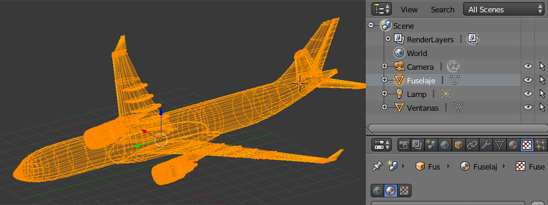 Retopologized A330
Production
One of the key tools was for us was Git, we got used to working "development" branch and having a "master" branch only for what was to be uploaded to production. Also thanks to Grunt, the result uploaded to production was minimized to reduce the size of and compress javascript file containing over 100 classes, both for the desktop and the mobile versions.
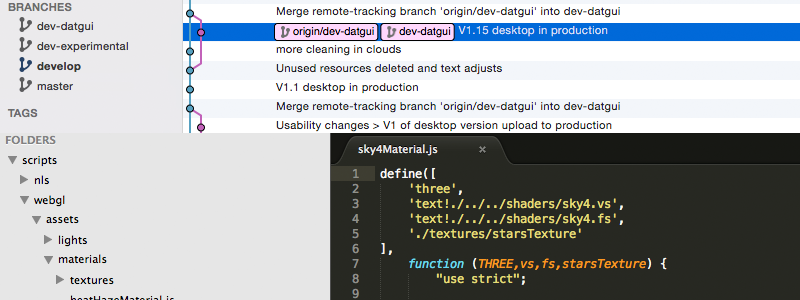 Git and Sublime Text
To coordinate, Trello was an essential tool for assigning tasks and priorities. Another great discovery, when prototyping and sharing, was Marvel's service. It allowed us to share interactive user sketches so the agency and client could understand the usability and screen flow before actual production of the project.
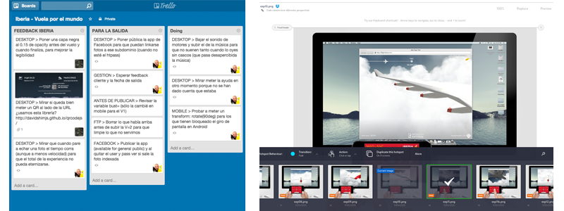 Trello and Marvel.app
Final result
In the end, the result can be seen in flight.iberia.com. You can enjoy the experience from a mobile or tablet as well as from your computer.
To make it more social, we added a feature for you to capture any frame of the flight to share or download it as wallpaper for your desktop.
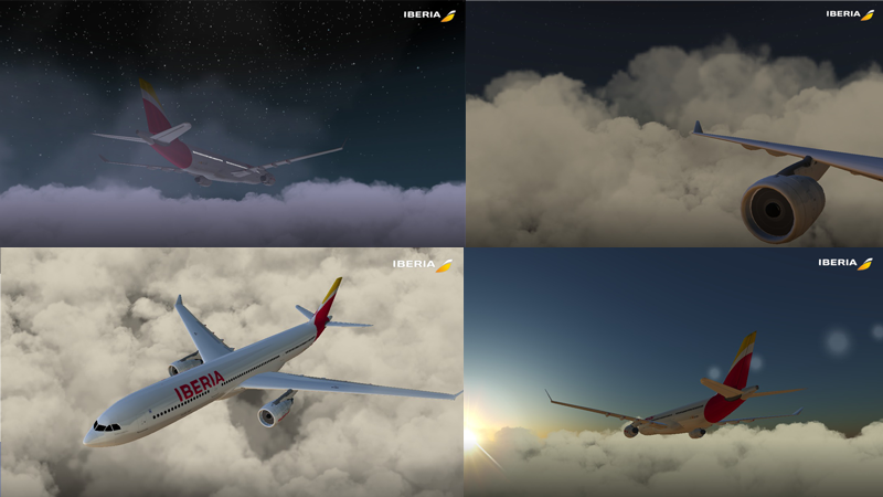 Flight screen-captures
Future challenges
If you have found this article interesting and would like to pursue a 3D web project, we’d be happy to hear from you. Here you can find different ways to contact or find out more about us.
Details
Production: Unboring.net
Client: Tinkle Spain / Iberia Airlines
Published: February 2015
Credits
Unboring.net
Arturo Paracuellos (@arturitu) - Direction, Design & Development (webGL coding)
Daniel Castilla - HTML/CSS coding
Collaborators
Miguel Ángel García (@tribadelics) - webGL coding
Guillermo Laporta (guillermolaporta.com) - Sound design


 A WebVR experience to prove your piloting skills above the clouds.
 How to turn a 6 slides keynote into a WebVR experience
 How to make an interactive VR story for everyone