ENJOY Puzzle Rain by MozillaVR WebVR experience now
This is a resume of how we make an interactive VR experience that combines game design techniques with the story development of animated movies, and it was made with a web based workflows.
This was the first phrase of the design document, and for me is very important to remark all these four concepts because only if we pay attention & care to all we will have something remarkable.
 First sketches made with Blender
UX tips for an interactive VR experience
I believe that Virtual Reality is a medium which offer us an opportunity to create a new language, different or an evolution of others who already know. For me, is not enough to have a game mechanic, neither to tell a linear story, I want to offer to the user an environment and abilities to have a pleasant journey.
These are some interesting things what happens during project development:
Working with a room-scale scenario
In the first prototypes of the project you need to move to wake up the creatures who are placed near the limit of the room. These positions was variable depending the size of your room, but with very small room sizes even with 2x3 meters the chaperone appears continuously. And having in the horizon to be playable for Oculus Rift without room scale setup, here with the help and feedback of Chris, we decide to change the gameplay to something more static and playable from the center of the room.
Lesson learned: Try to think in a mechanic playable statically or implement a locomotion system.
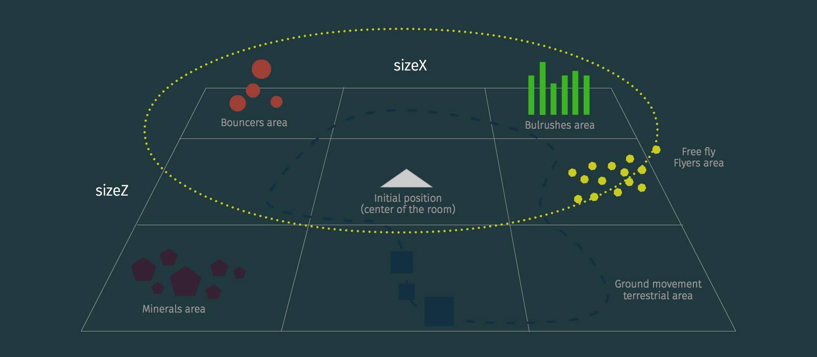 Initial distribution of creatures in the room
About helpers
I always hate instructions, tutorials or helpers, they are very, very useful (I know) but is a great exercise to try to prevent any of them if you want to design a really immersive experience, if you add a tutorial you break the presence you break the state being present there.
Lesson learned: Is very difficult to require complex (even simple) actions to the users if they does not expected. I know maybe this is a good reason to add helpers, but I would encourage designers to try without them (at least in projects more creative than functional).
The shape of the controllers
Another problem was how will be the interaction with the magical creatures, first you dispatch magic to wake them, the second try was use your hands as magnets to attract them, but always the controllers has a human hand shape and the most intuitive way to use it is to act as a hand, with the ability to take things. Again, without the vision of Casey and Chis we would not have reached this conclusion.
Lesson learned: Is more easy to understand and better for the presence, if if has a similar shape as the function performed by the controller. For example if you want to dispatch magic it be great to catch a magic baton, or if you paint (as A-Painter) you have a tool similar to a pen.
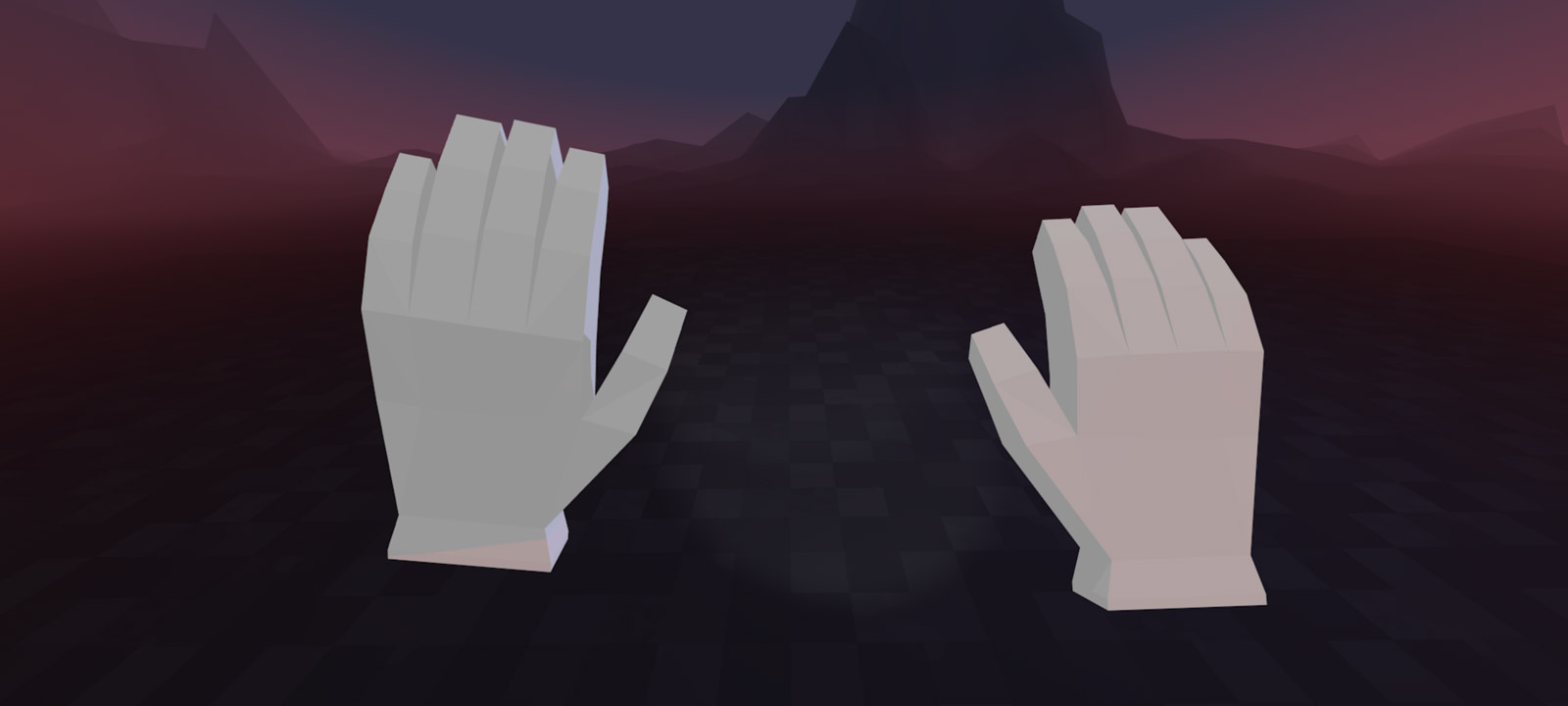 Hands as controllers
Ergonomic
I think we always overestimate what will be the user effort will do to interact with our project. The actual users are lazy and avery day need more rewards to make an effort. And VR is a medium that requires much effort (visually and physically). Owlchemy Labs has an awesome conference where they talked about ergonomic and many other interesting VR related things.
Lesson learned: Try to balancing the effort to require to the user, make sure it will be worth it to turning, bend over...
Story & Art development
If I have to take ideas for this part of the process, I always review ‘the blue umbrella’ and its beautiful holiday calendar directed by Saschka Unseld who is now working on Oculus Story Studio, and from here I would send him a big thank for the inspiration he has given me with his work.
Where the inspiration comes
The art basically from games & animation movies. I remember that in one of the first brainstormings with Diego & Fernando in Madrid was the art book of Fantasia and I though it would be great to to get the user would feel as if the magic of Mickey in his hands (finally this mechanic was dropped but had a very beauty origin). Basic animations of the initial Pixar shortfilms or musical games as Locoroco or ambiental as FlOwer from the creators of Journey game.
 Mickey (Disney), Tin Toy (Pixar), FlOwer (thatgamecompany) & Locoroco (Sony)
The characters
The best source to learn how to create them are classic animation books & art books of animated movies. I’m sure this work It will not be remembered for the quality of his characters because are ver very simple, this was because I wanted to reduce at the minimum the number of polygons on behalf of performance (although later I discover is more important the number of draw calls than polygons if they are not excessive. On an early stages of the project, Fernando made some asesome shaders to the character, but unfortunately they were not included in the final design.
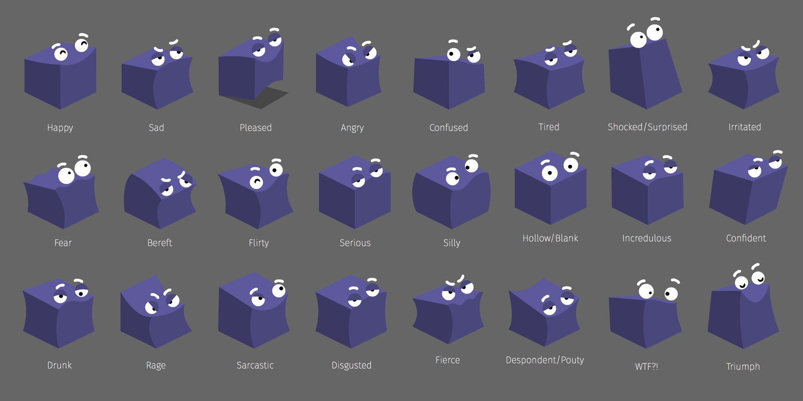 Some of the expressions designed (discated) for characters
The initial idea was to create an orchestra in which every family of instruments will be a race of creatures, each race will have its color, shape and behaviour. And you’d be the conductor of this orchestra.
 Planets (Bass), Bulrushes (Arp/Piano), Flyers (Woodwings), Minerals (Percussion) & Terrestrials (Strings)
Color & shapes
How important is to have a color palette for your project, since for a website to a movie, color is one of the primary things you can use to communicate emotions. On this project the color palette has a grey world, with you as black/white character (depending if you are touched for the initial magic ball) and with 5 complementary colors for each race of mythical creatures.
 Color & shapes schema of the creatures
Also the palette has an evolution as you progress on the journey, when all the world is asleep is very low saturated, and as you awaken is like the day comes all the color are more saturated and brighter.
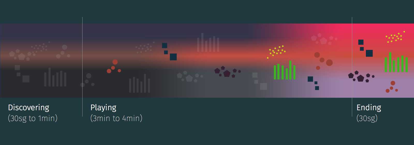 Interactive color script
Music
This part is the most remarkable of the project and is thanks to the work of my friend Guillermo Laporta, a New York based music composer and director of multidisciplinary concerts and spectacles there. Much of the references I sent him was original soundtracks of sci-fi movies and games. I think the most listened song until he sent me first sketches of the soundtrack was "The Departure" of Michael Nyman for the Gattaca OST.
Another important point to achieve was how the music convey the emotions we want to transmit to the user. This graphic was a reference for that goal. We want to start with a feeling of calm growing as we interact, and ending with an exciting crescendo.
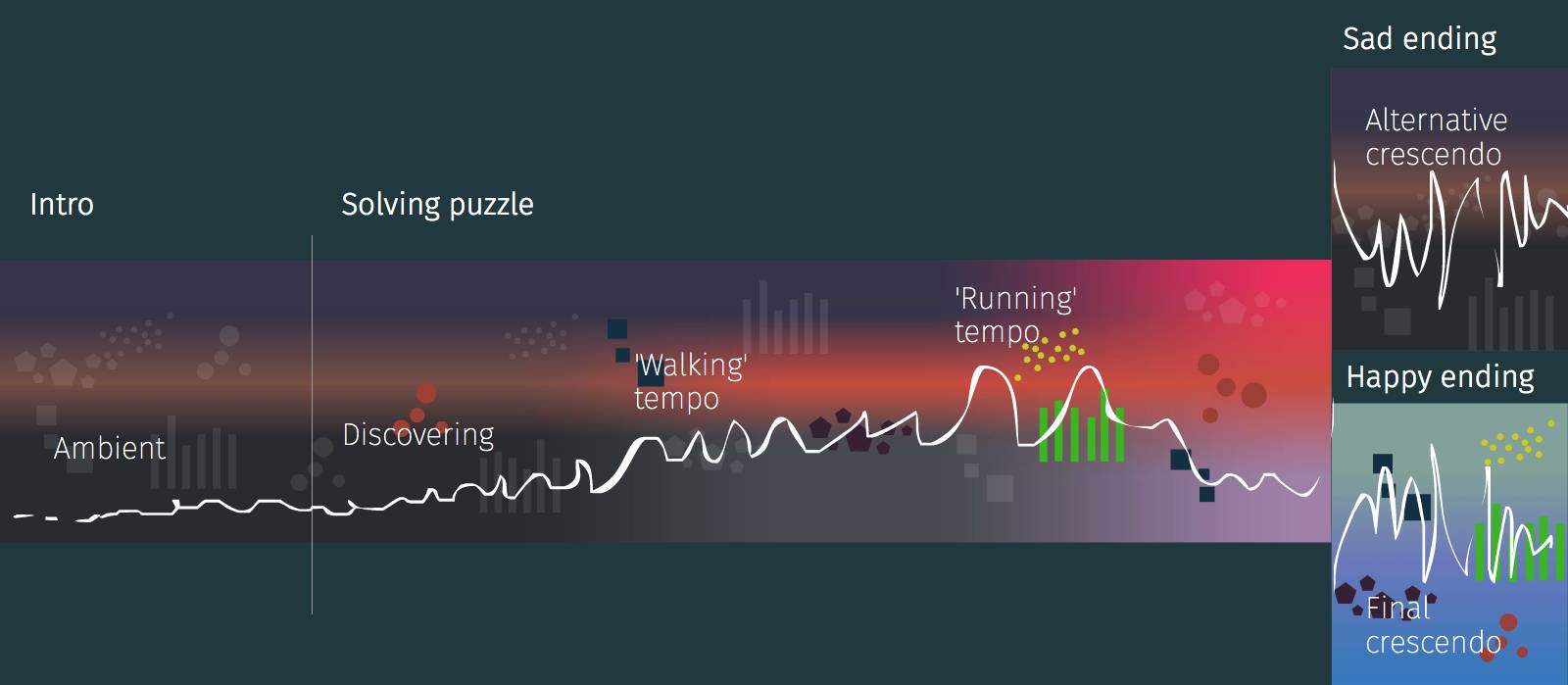 Music scructure schema
We tried to associate the sound of this family of instruments with the behaviours of each race of characters. But this was very hard, until Guillermo recorded some chorus combining different voice tones. That was awesome! now we can add a simple mouth to show how they sing and bight with the music.
Game design
First, find the mechanic
Has as reference game design books is a good start point to apply their rules to your project. We created a game desing document with some similarities of a 10 page game gesing document referenced in the Scott Rogers book Level Up!. But I forgot one of the first rules when you develop a game: prototype, prototype & prototype until you have the desired mechanic.
I recognize that I’m always worked with a tight deadline, and I prioritized to adjust everything to have finished the project at the middle on June but when we didn’t have a clear ‘winner mechanic’, and then when the project took longer we had to redo several times.
A clear goal
Another problem which is endemic to all projects is that in your mind is very clear what the user needs to do, but usually the user doesn’t know what to do. For this reason to test with multiple users, to view their reactions is very important, once again the help of Casey & Chris who tested with final users was an invaluable help.
We start with an open mechanic where you could play awaken the characters but it was not fun. And we decide to create a clear goal, place the creatures in the correct place to complete your mission.
Length of the experience
To decide this, is very important to know how the user will consume your experience because if is on a exhibition they don’t have much time to play and is better to have a short experience but grateful than a longer experience. Originally the idea was to show the project on a Mozilla All Hands meeting in London where we don’t have a lot of time to test, and we want to a positive impact on them. With that conditions we think it would be better to have a duration between 3 and 5 minutes.
Alternative endings
To reinforce that this was not a linear story, we decided to create two alternative ending if you complete your mission at time or not. One would be sad and the other happy.
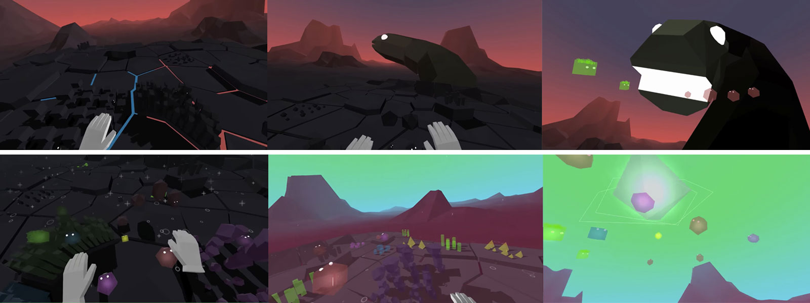 Captures of the two alternative endings
Technology & workflows
We created a project with browserify and using three.js for 3D & tween.js for some animations. After Chris add some modules and scripts to load the scene asynchronously.
Dev with Mac, test on Windows though localhost
I invested more than 90% of the time working with a laptop (in my case, a Macbook Pro) modelling, rigging & animating with Blender and exporting to three.js, coding with Atom a project with budo (a browserify server) which allow us to test on the Windows based desktop computer was connected to the same network.
Debug mode
Adding some exceptions inside the code, we can test the experience without any headset connected and with any browser. In our case the solusion was, use OrbitControls with the mouse to control the head set position, and use some keys to handle the controllers.
If you access with ?mode=debug you can control the experience without having a headset or browser that support WebVR API 1.0
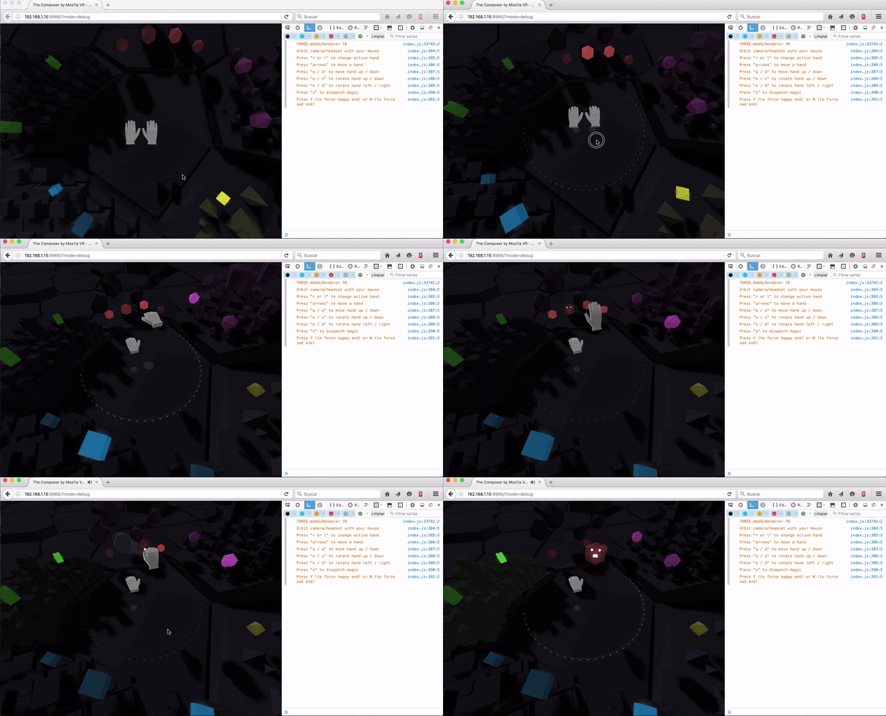 Capture of the debug mode
Reducing drawcalls (Animations in Blender)
The main problem with performance was to reduce the number of drawcalls trying to have multiple creatures animated more than the number of polygons.
First, I tried to animate creatures individually but when you have more than 150 drawcalls the performance drops down. To improve this I animated some of the particles with bones with Blender, and other individually.
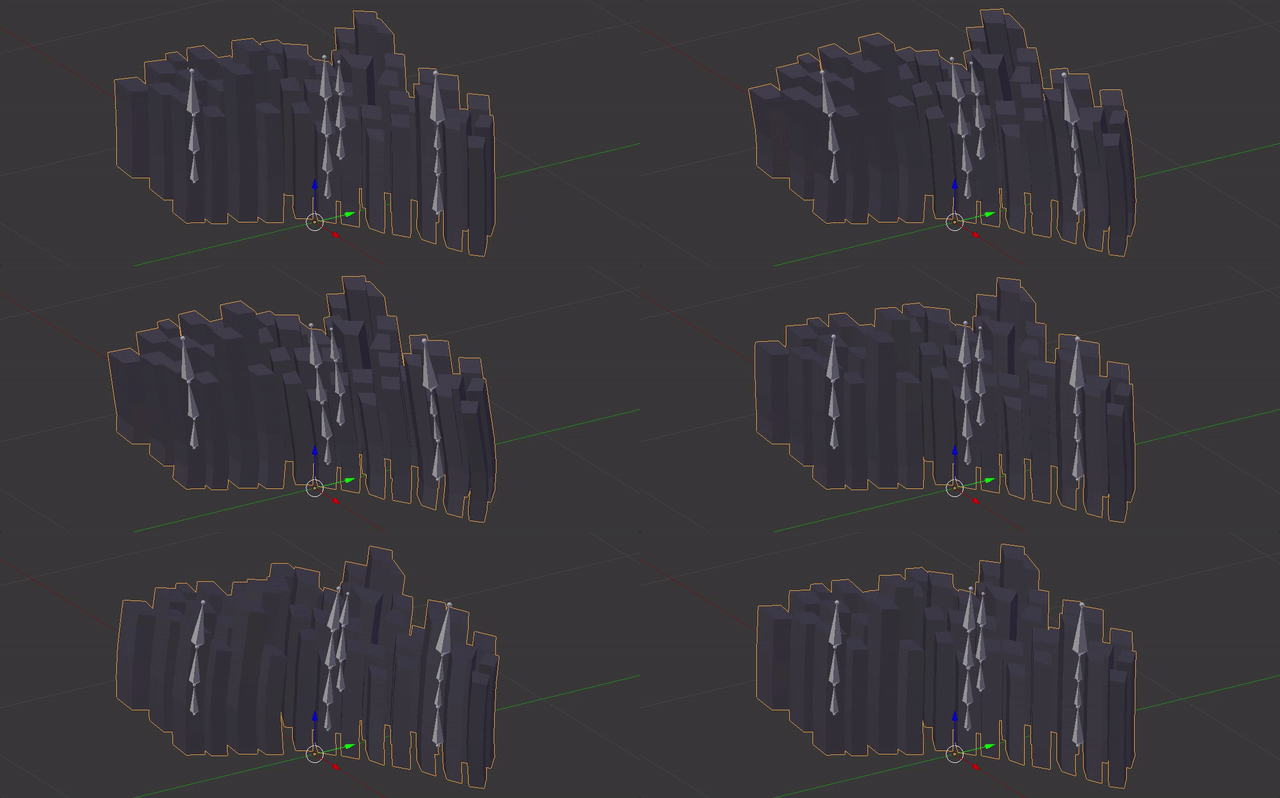 Capture of some creatures animated
Particles & behaviours
Another important thing was what kind of particles we could use it to add some effects to the interactivity. I used this GPGPU particle system ported from TDL to three.js by my friend Tribadelics.
As we want to add some intelligence behaviour to the creatures which will be interact with us, we develop some autonomous agents from this chapter of "The Nature of code" ebook.
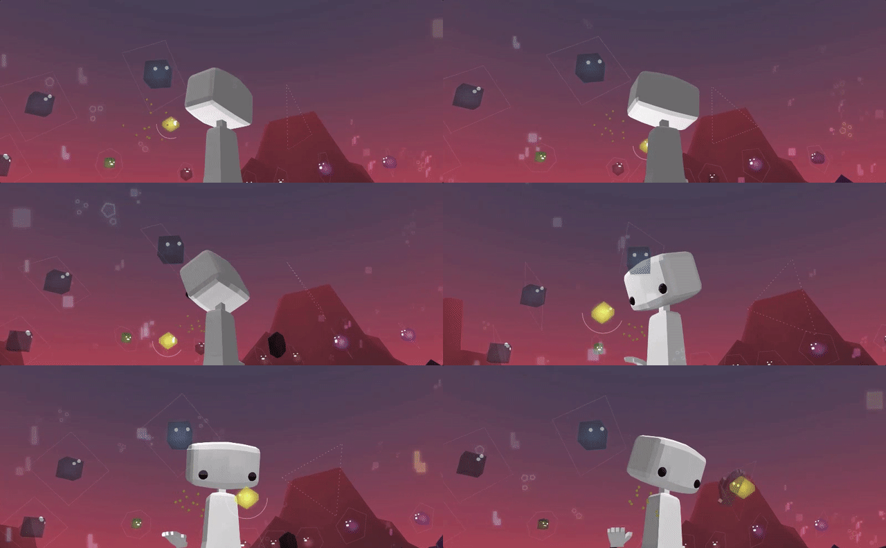 Capture of a separation & seek behaviour
Project details
We achieve to have stable 90fps with a minimum specification PC for VR (NVIDIA GTX 970, Intel i5-4590, and 8GB RAM) with:
- Up to 145 drawcalls
- Around 50.000 polygons
- 14 textures
- 19Mb of weight
Thanks to all MozillaVR team members (Fernando, Diego, Chris, Casey, Kevin & Kip) for making me feel part of the team these weeks that I worked with you. The journey was not easy but I hope all of us learning or growing in some way.
A case study by
Arturo Paracuellos
Creative technologist & 100% of unboring.net
Email | Twitter | Github | LinkedIn
"I am open to collaborating in new projects and to work remotely with companies on real time render projects, especially if they are focused on VR.


 A WebVR experience to prove your piloting skills above the clouds.
 How to turn a 6 slides keynote into a WebVR experience
 How to make an interactive VR story for everyone