ENJOY FUE - Deep Linking WebVR experience now
The challenge
FUE is a Spain-based foundation which prepares students for entry into the job market. Courses are run monthly by the organization for between 30 and 40 students. Usually a teacher shows a keynote with 6 slides to the students but a more innovative approach was being sought.
An opportunity arose while we were discussing the use of VR as an educational tool. They purchased one Google Cardboard 2.0 for every new student and together we decided to create a WebVR experience for the presentation.
I originally had the script, but I needed to transform it into a 3D experience with 6 scenes where the information could be taught effectively to the students.
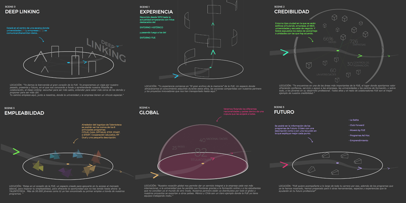 Skecthes of the virtual tour divided in 6 scenes
Turning a 2D script into a 3D experience
One of the initial things I wanted to achieve was to make the user feel as if they were on a theme park ride (with a look and feel similar to that of the Tron movie). Two ideas came to my mind; the movie Jurassic Park, specifically the scene where Sir Richard Attenborough shows the children how to clone new dinosaurs); and the Demoscene demo Obsidian by @mrdoob.
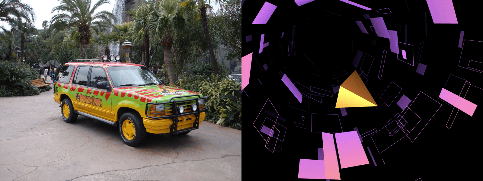 Jurassic Park / Obsidian - as inspirational concepts
With this premise I started to work with the original keynote and other notes to create a visit to a "Tron theme park" with 6 stops. It started and finished in the same scenery but transformed with light and effects and explained "What FUE creates and what it can create for you".
Making a responsive WebVR site
To understand the next sections (UI/UX & Technical challenges) it is necessary to know that my challenge was to create a 3D experience that was seen by the largest number of users (regardless of the device with which they would connect). I think this is one of the advantages of WebVR over native based VR.
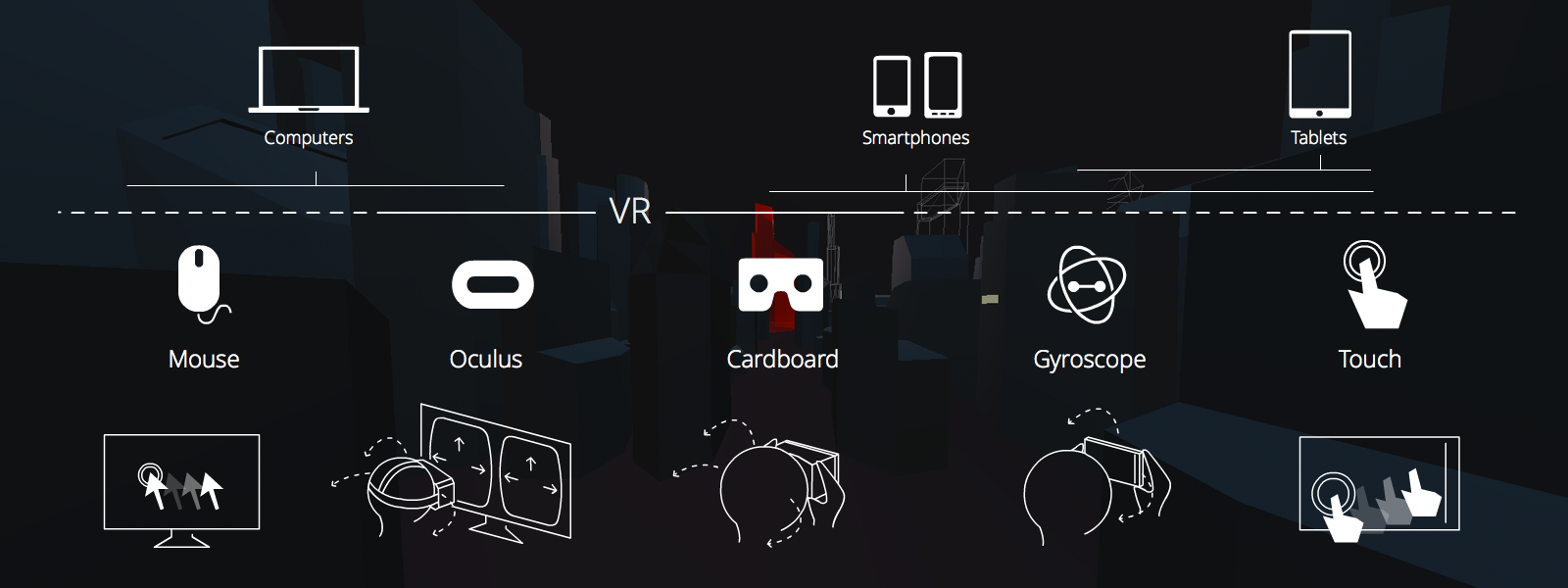 My responsive WebVR solution
It is important to acknowledge that some designs are chosen because they offer a halfway point between the best solution for VR and the best solution for a regular 3D experience ( trying not branch a lot the code to obtain with the same project, a good experience in both situations ).
For example, when you are watching the experience with VR you focus on a small part of the screen and whole ( specially for texts ) is greater. For this reason I tried to render the texts with the smallest possible size on the screen. (Another trick is to use different FOVs for the camera depending on whether you are inside VR or not).
UI/UX in a WebVR experience
Looking for user confort
I wrote about eye strain and motion sickness with Mozilla documentation because these are the two most common problems we need to prevent when we design for VR (surely we will discover new tips in the future).
With this work I learnt that there are 2 important considerations:
- Neck movement: I wanted to create a feeling within the viewer that they were on a tour, seated on a train. Additionally I was tempted to make it feel more similar to a roller coaster than a calm tour at certain times; specifically when the user needed to pay more attention to text and audio; and for usability reasons when you placed a Navigation or Call to Action button.
- 180º confort zone: Trying to place the most important part of the scene within this area.
How to guide the user through your virtual world
- 1- Create an iconography When you have a 360º abstract world scene it is very difficult for the user to know what parts of the interface are interactive.
- 2- Use a path to guide the user In the event that you need to show more information in a specific order outside this comfort zone, attempt to add an intuitive path to guide the user.
- 3- Highlight interactive objects If any object is interactive try to create an interactive status when the user looks at it.
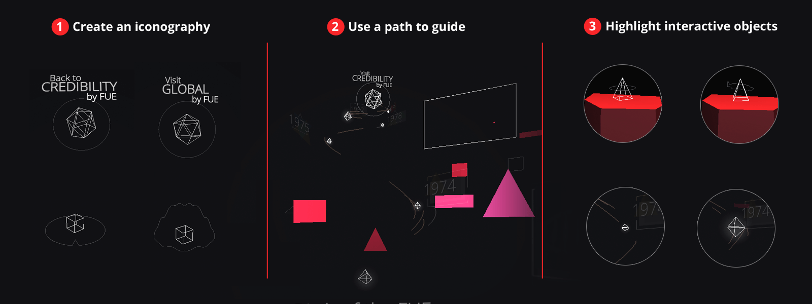 Tips to guide the user
Technical challenges
The pointer
One of the most important things to create was a pointer that helped the user know where they were looking. I needed to create one that worked with Cardboard 1.0 (without clicking on screen) and 2.0. I needed to create a timer to trigger the action in Cardboard 1.0 and a user touch trigger for Cardboard 2.0.
There was a large visual perspective problem: placing the pointer in front of the user at different distances caused the user to focus on objects at different distances.
To solve this I needed to move the pointer nearer to each interactive object, calculating a secure distance from the centre of the objects and scaling the pointer to maintain its size. When the user is not looking at an interactive object I placed the pointer at a comfortable distance of 2 meters.
Rendering texts
I have used two techniques to render text (it should be noted that I needed to work in two languages, Spanish and English, and for these I used the i18n solution for requireJS ). I needed to render a lot of different kind of text areas easily.
First I created a TextCanvas.js Class for which I set these parameters:
- var TextCanvas = function ( text, fontSize, w, h, color, bg, bold, textAlign ) {
And this Class create a canvas with the text drawn and added as a THREE.Texture to a THREE.PlaneBufferGeometry. But this option has one problem in that it is very difficult to adjust to the design. That said, it is great for a scalable site because you have text texts on JSON files and they are easy to edit.
The second and more commonly used technique in the project was creating text atlases (one for Spanish, one for English) with all the text from each scene and adding them as textures into Plane geometries in the Blender composition. This option makes it easier to add effects to the texts and place them in the best position according to your preferred design.
Designing scenes
I started to create the first two scenes programming inspired by Mrdoob Obsidian, but placing the objects in the best position for the design was a very slow process (perhaps due to my lack of experience in using the threejs Editor). I later discovered that using Blender to compose the scene, add lights and materials and to export to json format and import with THREE.ObjectLoader was very easy.
Two things that I had in mind to improve the performance were:
- Minimize transparency, as inspired by this talk about best practices for mobile VR.
- Merging big geometries with the mergeMesh method of THREE.Geometry.
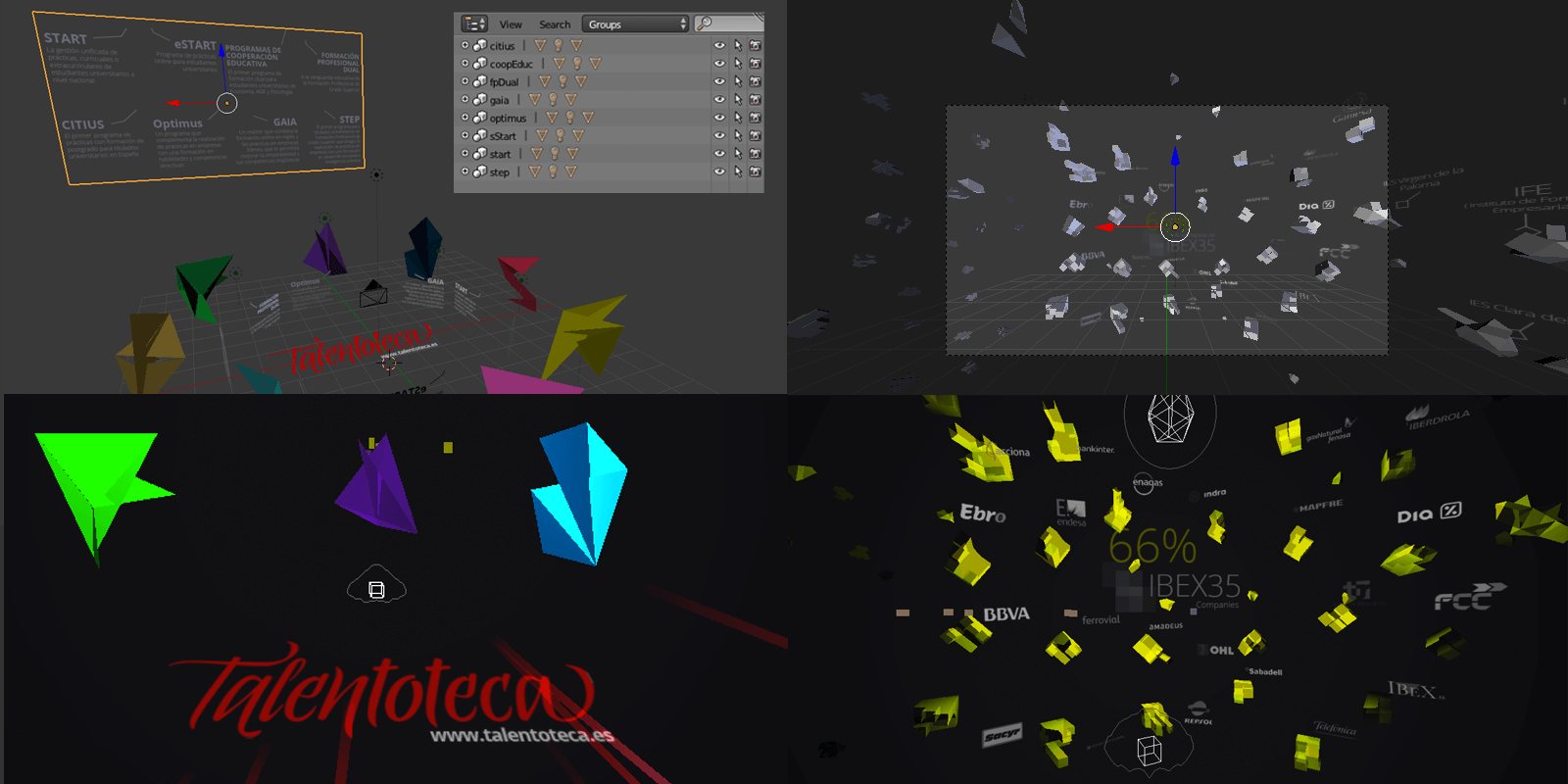 Comparison of scenes in Blender with final render
Playing with splines
While looking for a thread that helps the user to follow the path and for a solution to move the camera in a specific way I realized that I needed to learn more about splines. One of the first things that helped me was the zz85 spline editor that I used to visualize the original route between scenes: The first idea was to create a way with different stops and orientations but this did not work.
Finally the best solution for the UX was to create some splines which accompanied the user when changing scene, to take advantage of a fade to black to load the next scene and to restore the orientation shown in front of the user at the next scene. These lines were also based on the chasing bezies lights of Joshua Koo.
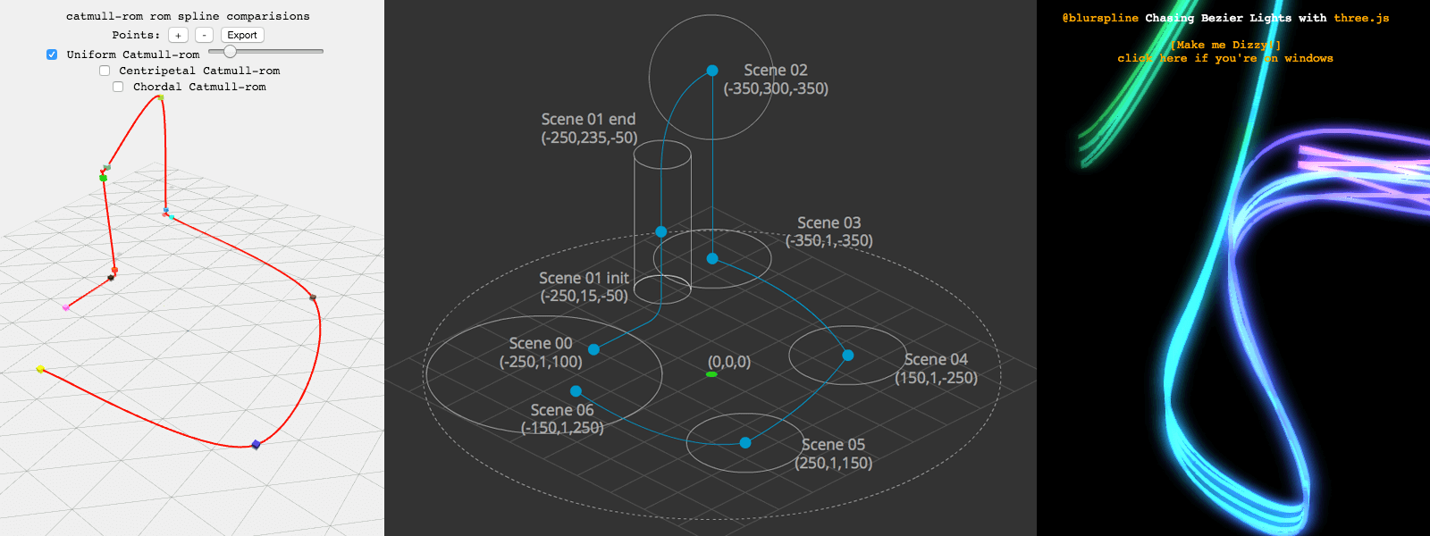 Playing with splines
The importance of sound design on VR
Thanks to Guillermo Laporta and his team, we were able to create an atmospheric base track. He casually thought of a soundtrack while viewing these sketches and I have started to use the soundtrack on the project test model. The soundtrack is the Instellertellar OST. This ambient track accompanies us throughout our journey.
We have also included some sound effects; for example when the user moves from one scene to the next following the light path or when looking at any interactive object. It is important to include a sound effect for emphasis.
Another important audio factor was the voiceover of the narrator. On arriving at each scene the narrator explains the corresponding component of the Foundation. I needed to highlight and to visually animate the sound to indicate to the user where the sounds came from and when these sounds were activated (in case the user was not using headphones).
In the FUTURE scene I had another challenge to overcome: to have a 360 degree scene with 5 sounds in addition to the main one. It was very important to locate the sounds in the 3D space using THREE.Audio and THREE.AudioListener.
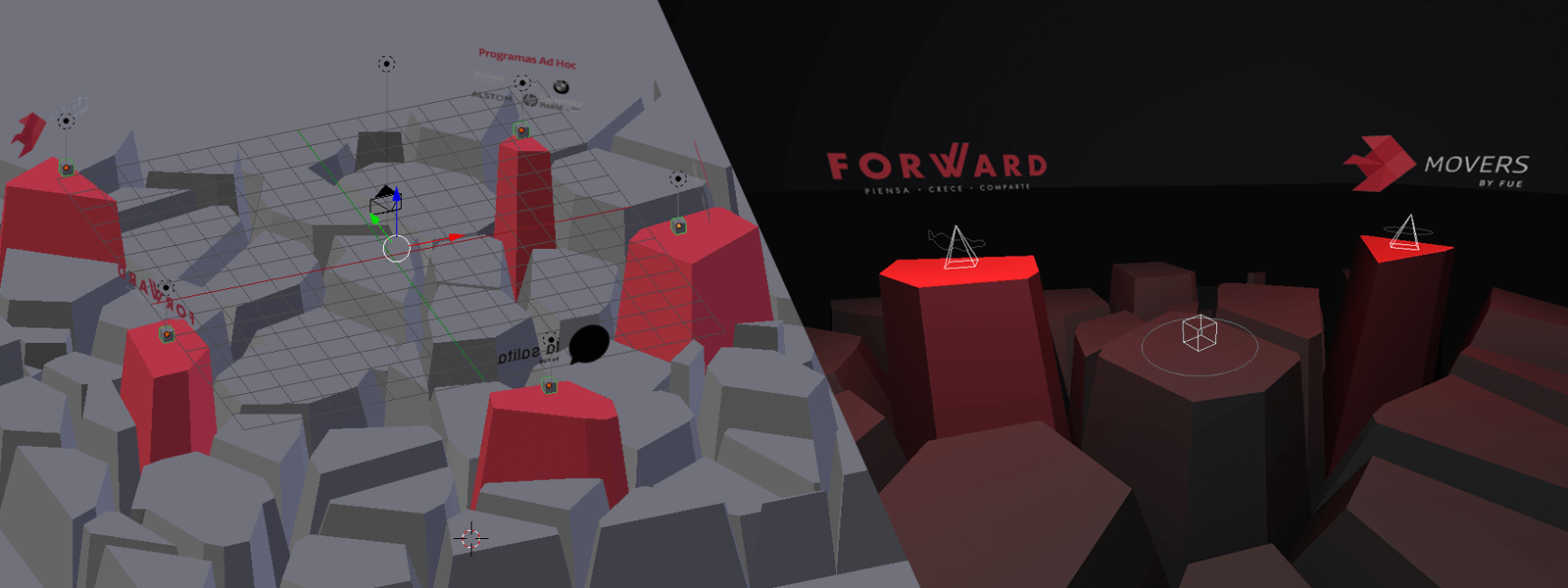 3D audio location on FUTURE scene
Final result
Click the link to enjoy FUE - Deep Linking (You can use the number keys 0 to 6 to go directly to a specific section).
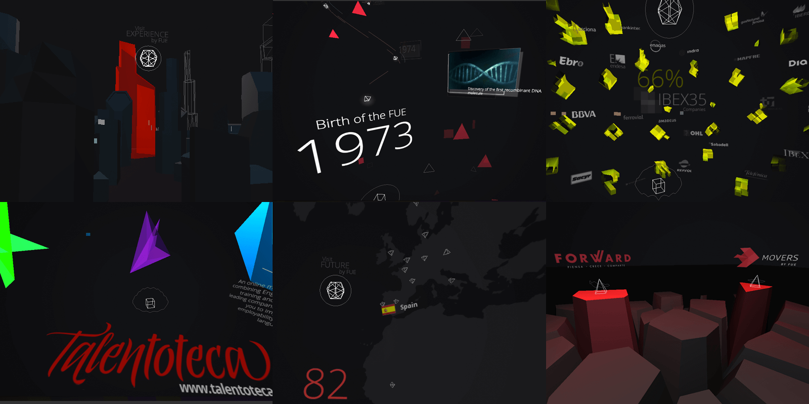 6 scenes of the project
Conclusions
"With VR you can make fireworks or a solid product with a strategic goal depending on your needs. In both cases, WebVR can help you.
- 1) VR is a great new language to create new interfaces and interactions, to make the users feel part of your world, to achieve a sense of presence and to tell them your message in a new way. It needs a great deal of user effort but it brings large rewards. There are good opportunities to start developing VR with the Unity/Ureal Engine for desktop (Oculus/HTC Vive) or mobile (GearVR) but we are a long way from creating full VR experiences at present because the hardware/software is not yet ready.
- 2) WebVR provides a good opportunity to start creating/sketching VR very quickly and to get to the users more directly. You can develop one project that works with both mobile iOS/Android and desktop based headsets.
- 3) Responsibe WebVR is the best solution for creating a 3D/VR experience for the widest audience possible, even if they do not have these VR devices. To know more about this you can read my article at Awwwards.com, Do websites dream of virtual reality?
About me
Arturo Paracuellos
Creative technologist & 100% of unboring.net
Email | Twitter | LinkedIn
"I am open to collaborating in new projects and to work remotely with companies on real time render projects, especially if they are focused on VR.


 A WebVR experience to prove your piloting skills above the clouds.
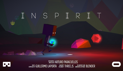 How to make an interactive VR story for everyone
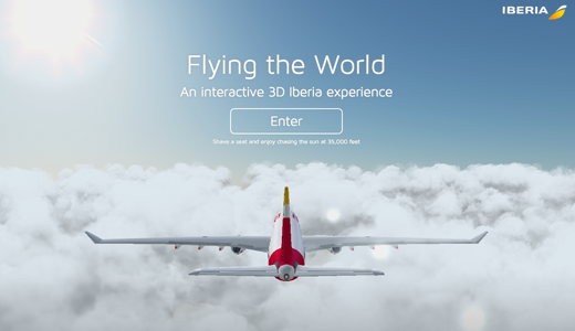 A real-time WebGL experience in sync with mobile devices